There is no option to choose a non-responsive design when creating the email template. Choose a responsive template without hesitation or second thoughts. Although there are other options, such as fluid or scalable design, the responsive strategy has gained widespread use. We need to investigate this further to determine the cause.
Initially, responsive layouts were used in online idea creation. In the long run, it even made its way into email layout. Thanks to the proliferation of affordable mobile phones brought about by the tech boom of 2005, formerly inaccessible technologies like smartphones are now within reach of a far larger public.
It came as a big surprise that, with so many people using mobile devices, there are no reliable data. Statistics vary widely amongst the various sources. According to data compiled by CrunchBase, by 2020 there will be over 26 billion mobile devices and 6.1% of the world’s population will use a mobile device. According to Statista, there are 2.87 billion mobile phone users worldwide. Wow, that’s a big change.
Data from email marketing campaigns becomes more transparent. Litmus reports that, on average, 54% of emails are opened on mobile devices in 2017, while 34% of users solely use mobile devices to check their inboxes. Companies increased the frequency with which they sent emails that were optimized for mobile devices by 22% in 2017. Only 39% of businesses make adaptable email designs, while 52% stick with the bare minimum to ensure their emails look well across all devices. It seems that the remaining 9 percent could care less about mobile optimization.
You may be surprised when you see your emails in your mobile device
The natural thing to do when you get a non-responsive email is to just delete it without opening it. It would be a waste of money to launch an email marketing campaign like this.
Your email editor should provide a built-in testing module to help you prevent this kind of problem. You may use this test to see how your email will look on various mobile and desktop devices. To avoid having to manually fix the HTML code, choose a quality email builder that can generate responsive emails on the fly.
Saving time during the design process is possible if the email editor provides a preview of the mobile version. The mobile email app may not do justice to certain features that seem great on a desktop version. Adapting the desktop version for mobile use is sometimes necessary.
When and how to deploy responsive design.
The use of “@media” inquiries is fundamental to the idea of responsive email design. You can basically design the look for any width of screen. The maximum width should be defined in pixels, and the element sizes should be defined in percentages. In this method, problems with the email review process may be avoided.
To best declare responsive design, consider the following:
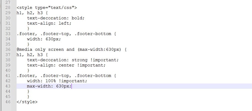
In this demonstration, the desktop style is created without the usage of media queries, whereas the mobile style adopts the “screen” type. Emails are designed to be read either on a desktop computer, where the text will be aligned to the left, or on a mobile device, where it will be centered for the viewer. It goes without saying that you are free to specify any style, from the font family to the sizes and placement of elements, in place of or in addition to text alignment.
The way modern responsive designs work
To be more precise, a responsive layout allows you to display two distinct email samples for mobile and desktop users. Naturally, you’ll want to make duplicate templates. As a consequence of its ability to decrease mobile template size, it is the optimal option for the mobile-first strategy. Also, if you make a mobile-specific version of your email template, you won’t have to deal with issues like too-small text, too-large images, horizontal scrolling that takes forever, etc.
But there’s no need to create two separate email formats. You may simply establish two distinct looks and indicate which one will be utilized based on the width of the user’s display. This method is more common than the alternative of using a variety of already templates. As a consequence, you have a solution that adapts to different screen sizes without looking worse than standard email layouts.
In a responsive email template, the width is only one of several variables that may be set. You have the freedom to choose various element sizes for use in both desktop and mobile views. The functionality provides for a significant enhancement in the user experience. Specifying styles that may not be supported by various email clients is unnecessary. Simplicity is the foundation of every responsive design. In addition to defining styles for various widths and heights, you can also specify the layout to apply to various screen orientations.
E-Mail Inspection Tools
The email testing phase is an integral part of the responsive email design process. You may do this with the help of services like Litmus and Email on Acid… If you want to use one of these programmes to edit your HTML email, all you have to do is copy the code from your email and put it in.
Across other words, you can quickly and easily preview your emails in 70+ email clients and devices with just one click using our built-in email testing tool. If you take the time to test your emails, you can rest easy knowing that they will appear precisely as you intended in your recipients’ Inboxes.
Recommended reading on the topic of adaptive email layout:
Email Design Review is an informative website all about the best responsive design practises, complete with examples.
The lessons presented at Litmus’ 2014 Email Design Conference will help you brush up on your understanding of responsive email design and push you to learn more.
The eBook on Email Design from Smashing Magazine is a great resource, full of fascinating studies and enticing methods.
Jason Rodriguez, one of the greatest professional email designers on Litmus, wrote a book titled Modern HTML Email.
In Conclusion
I’m hoping the ideas presented here will motivate you to come up with the most elegant responsive email solution ever.
However, you won’t be able to modify or optimize the code when using an email editor that generates responsive email templates. In order to optimize email code, a super rule that reads “Don’t touch that works” may not be the ideal solution.
Sometimes you can’t even see this code, so you have to blindly trust that your email will be responsive even if you have no clue which method is being utilized. It’s a common misconception that “responsive” means everything is optimized for mobile use.
That’s why it’s important to use only a trustworthy email editor that lets you import, modify, and export all HTML messages without hiding any code from you.